
South Africa Trumped by Tariffs
5 AUGUST 2025
This chart is powered by Excel. You don't need fancy tools. Just Excel
There’s no one-size-fits-all in financial storytelling. Sometimes a chart works, sometimes a table, and sometimes even a map is the best way to tell the story.
This Week's Chart Drop
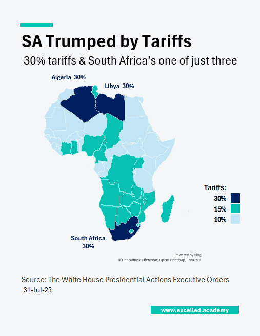
Last week’s stock market rally didn’t last long. This week, markets were shaken by Trump’s new tariffs. South Africa faces a 30% tariff, more than double most other African nations, while Lesotho negotiated theirs down from 50% to 15%. This was the perfect opportunity to try a map chart, showing the geographic impact at a glance.
This Week's Design Trick
Excel’s Map chart works for quick geographic visuals, but customising and formatting are limited. Trying alternative tools can give better control and design flexibility.
Each week, I share one simple Excel visual—from sport, business, or personal finance—to give finance professionals ideas on how to present their data.
Subscribe to get the weekly chart to your inbox