
Berkshire Hathaway's 60 year run
11 NOVEMBER 2025
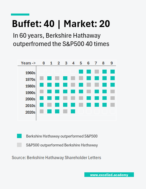
Chart Drop: Berkshire's Cash Mountain
Berkshire Hathaway is holding $382 billion in cash, more than Google, Apple, and Amazon combined. For twelve consecutive quarters, Warren Buffett has been a net seller of equities and has not repurchased Berkshire’s own shares. While headlines question whether the Oracle has lost his touch, Buffett has outperformed the market in 40 of the last 60 years and has beaten it 60% of the time this decade so far.
This Visual is designed for:
- Market and investment commentary
- Long-term performance analysis
- Editorial features on capital allocation
Contact us to licence or commission a visual