
The F1 Season Conclusion
9 DECEMBER 2025
This chart is powered by Excel. You don't need fancy tools. Just Excel
Most finance teams rely on tables because they look like the easiest way to present data, yet tables are one of the hardest visuals to get right. When you land on a layout that works (which can take a few tries), save it is a reusable template.
This Week's Chart Drop
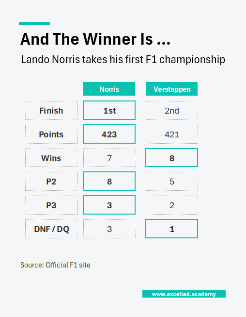
Max Verstappen came within two points of claiming a fifth consecutive F1 Drivers Championship, but Lando Norris did what was needed to secure his first. It was a season defined by swings: McLaren had the fastest car but dropped points through mistakes, while Verstappen maximised opportunities and stayed in the fight. Interestingly, Norris had one fewer win than Verstappen, yet his eight second place finishes ultimately made the difference
This Week's Design Trick
When you’re short on time, the quickest way to make a table more readable is simply to add spacing. Inserting blank rows and columns immediately reduces cognitive load and gives the eye space to process information. From there, use colour sparingly, either by changing the font colour or adding a border around key cells.
Each week, I share one simple Excel visual—from sport, business, or personal finance—to give finance professionals ideas on how to present their data.
Subscribe to get the weekly chart to your inbox