
F1 Drivers Championship
28 OCTOBER 2025
This chart is powered by Excel. You don't need fancy tools. Just Excel
When sharing data, should you lead with the headlines or dive into the details? The trick is presenting it in a way that gives the audience what they need to know
This Week's Chart Drop
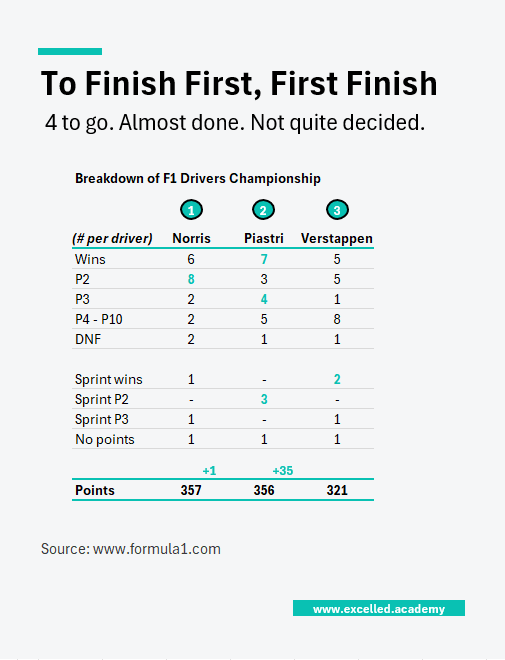
Following Norris's statement win in Mexico, he now leads the F1 drivers championship by 1 point (headline). This was built off 6 wins and 8 second point finishes (details).
This Week's Design Trick
Excel’s Camera Tool lets you take a live snapshot of data from one tab and place it anywhere else, for example, in a presentation tab. Any changes made to the original data automatically update in the snapshot.
For Microsoft 365 users, “Paste as Linked Picture” does the same thing. This isn’t just great for visuals — you can also snapshot financials to check balances across sheets or tabs.
Each week, I share one simple Excel visual—from sport, business, or personal finance—to give finance professionals ideas on how to present their data.
Subscribe to get the weekly chart to your inbox