
F1 Team Valuations
2 DECEMBER 2025
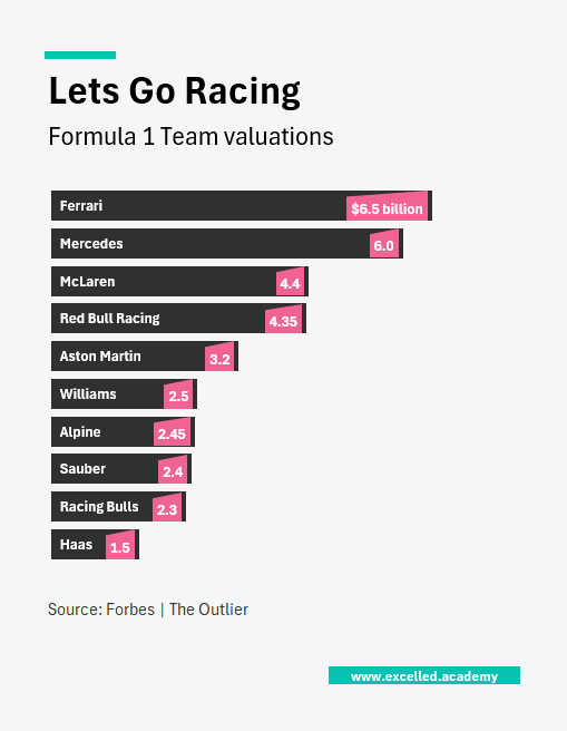
Chart Drop: F1 Team Valuations
Ferrari is now the most valuable Formula 1 team, valued at $6.5 billion, with Mercedes close behind at $6 billion. Every team on the grid is worth at least $1.5 billion, up from just four teams reaching that level two years ago. The sport’s rapid growth has been driven by a broader global audience, fuelled by Drive to Survive and Formula 1’s expanding media presence.
This Visual is designed for:
- Business and sports commentary
- Valuation and brand analysis
- Editorial features and pitch decks
Contact us to licence or commission a visual