
Gold Rush 2.0
14 OCTOBER 2025
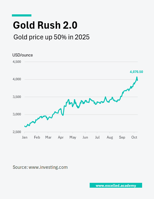
Chart Drop: Gold’s Strongest Rally in Decades
Gold is up 50% this year, with a sharp acceleration in September alone. As geopolitical risk and economic uncertainty rise, investors have rotated back into gold as a defensive asset. The scale and speed of the move make this the strongest rally since the 1970s, reigniting debate around safe havens and capital preservation.
This Visual is designed for:
- Market commentary and macro analysis
- Investor briefings
- Editorial features on commodities and risk sentiment
Contact us to licence or commission a visual