
The End Writes The Story
22 JULY 2025
This chart is powered by Excel. You don't need fancy tools. Just Excel
The way to get better at financial storytelling is to stick with it. Experiment, learn from feedback, and keep showing up. Over time, the results will speak for themselves
This Week's Chart Drop
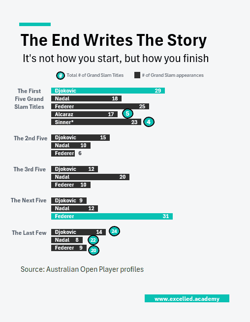
After watching the Wimbledon final, I was thinking about career trajectories.
With the Big Three (Federer, Nadal, Djokovic) nearing retirement, attention is turning to Alcaraz and Sinner. There’s plenty of hype. Some say they’re saving men’s tennis, but it’s still early days. After all, it's not how you start, but how you finish.
Alcaraz already has five Grand Slams in just 17 appearances. I wondered: how does his start stack up against the Big Three?
This Week's Design Trick
If your visual contains multiple objects (like this one, which has 18), you don't need to select each one individually. Simply click one object, then press Ctrl + A to select all objects on the sheet at once.
Each week, I share one simple Excel visual—from sport, business, or personal finance—to give finance professionals ideas on how to present their data
Subscribe to get the weekly chart to your inbox