
Millionaire HQ
23 SEPTEMBER 2025
This chart is powered by Excel. You don't need fancy tools. Just Excel
Being good with numbers isn’t enough in finance. To stand out, you must turn data into stories that people remember. Tables, though tricky, can be a powerful tool if designed well.
This Week's Chart Drop
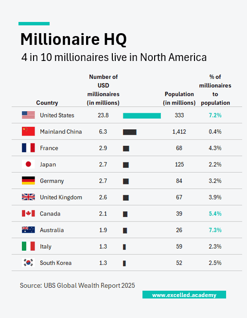
The Top 10 Rich List is dominated by Americans - 90% of the spots. Zooming out to the Top 100, 36 are American, nearly three times as many as China in second place. But looking at millionaires as a percentage of the population changes the story: smaller countries like Australia suddenly stand out.
This Week's Design Trick
Use Excel’s Data Type “Geography” to auto-populate flags and population for each country. No need to manually look up each one.
Each week, I share one simple Excel visual—from sport, business, or personal finance—to give finance professionals ideas on how to present their data.
Subscribe to get the weekly chart to your inbox