
Oracle's Share Price Rollercoaster
25 NOVEMBER 2025
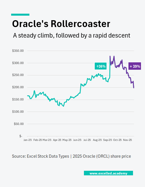
Chart Drop: A One-Day Surge
In mid-September, Larry Ellison briefly became the world’s richest person after Oracle’s share price jumped 36% in a single day. Much of that gain has since unwound. The stock remains up around 20% for the year, but the reversal has reignited questions about whether parts of the AI rally have run ahead of fundamentals.
This Visual can be used for:
- Market and earnings commentary
- Technology and AI coverage
- Investor updates and editorial features
Contact us to licence or commission a visual