
One Day Only
16 SEPTEMBER 2025
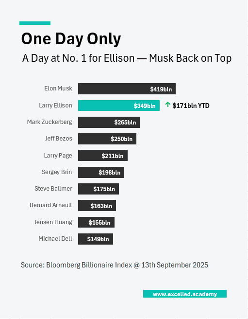
Chart Drop: The Biggest One-Day Wealth Surge on Record
On 10 September, Larry Ellison briefly became the richest person in the world after Oracle posted unexpectedly strong earnings. The move triggered the largest single-day increase in personal wealth ever recorded. Ellison’s net worth is up $170 billion this year alone, a reminder of how concentrated value creation can become when markets reprice a single company overnight.
This Visual can be used for:
- Market recaps
- Wealth rankings and business profiles
- Editorial use
Contact us to licence or commission a visual