
The 2025 F1 Season
1 JULY 2025
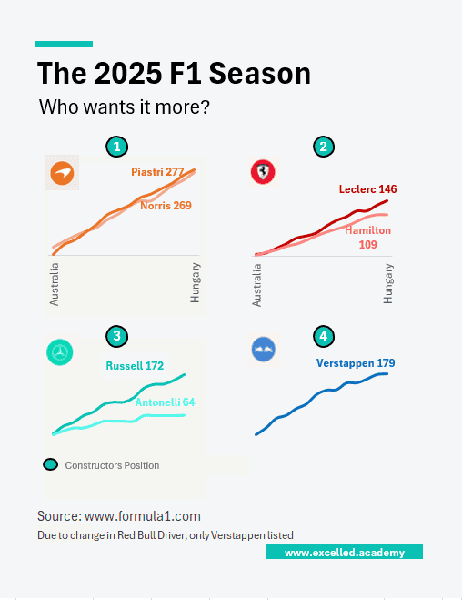
Chart Drop: Three Different Title Paths
McLaren is emerging as the car to beat this season, but the championship picture is shaped as much by driver dynamics as machinery. Piastri’s consistency contrasts with Norris’s raw pace and mistakes, while Verstappen remains a threat despite Red Bull’s internal instability. The title race is no longer just about speed.
This Visual is designed for:
- Sports analysis
- Editorial storytelling
- Race commentary and presentations
Contact us to licence or commission a visual