
The Springbok Story
26 AUGUST 2025
This chart is powered by Excel. You don't need fancy tools. Just Excel
In Financial Storytelling, sometimes what you leave out is just as powerful as what you show.
This Week's Chart Drop
In Jaws, the shark isn’t shown for most of the movie. Mechanical issues meant the shark model didn’t work reliably, forcing Spielberg to improvise. He hinted at the shark lurking beneath the water, building suspense through what wasn’t there. The unseen had far more impact than the visible. Financial storytelling works the same way: sometimes what you leave out is just as powerful as what you show.
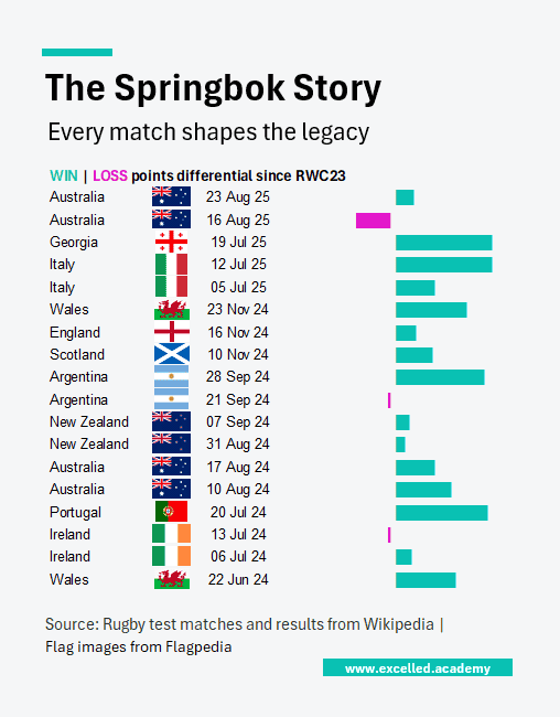
After South Africa’s 16-point loss to Australia in the Rugby Championship on 16 August, that’s all anyone talked about. No need to spell it out, everyone knew. But there’s more to the story if you let the audience fill in the gaps. This visual highlights the narrative without showing every detail.
This Week's Design Trick
A 2D bar chart might seem obvious, but the axes made it hard to show both country and match date. Instead, use the REPT formula to build a bar chart equivalent. It organizes the data like a table without it feeling like one.
Use Excel's IMAGE function to add each country’s flag (available in Excel 365 or Excel for the web). Geography data types can misgroup flags (e.g. Wales and Scotland under the UK).
Each week, I share one simple Excel visual—from sport, business, or personal finance—to give finance professionals ideas on how to present their data.
Subscribe to get the weekly chart to your inbox