Max Verstappen's F1 Seasons
16 DECEMBER 2025
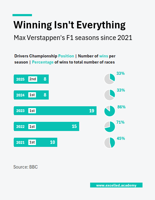
Chart Drop: More Wins. No Title.
In 2025, Max Verstappen won more races than any other driver and still didn’t win the championship. It’s a reminder that dominance in one metric doesn’t always translate into the final result. The gap between race wins and championship outcomes has appeared before in Formula 1 and will appear again.
Visual available for editorial use. Custom visuals available on commission.
Contact us to licence or commission a visual